
Risk mapping is an approach to illustrating the risk associated with an organisation, project or other system in a way which enables you to understand it better: what’s important, what’s not, and whether the risk picture is comprehensive.
Risk mapping is primarily qualitative and its benefits are:
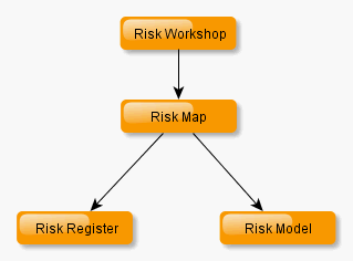
The aim of risk mapping is to present pictures in influence diagram form, that is, flow charts showing chains of cause and effect starting from the basic risk events or uncertainties and ending with the ultimate impacts on the objectives of the organisation or project.
This recognises that risks are not neat, isolated cause-event-effect strings, as you might think from risk register formats, but are interrelated and often form complex networks. The diagrams can be viewed at different levels of detail, enabling both an overview and an understanding of detail where this is relevant. Of course this means that risk mapping is more relevant to complex systems – programmes of projects, activities competing for resources, and so on – but in our experience the risk mapping almost always gives useful insights for your risk work.
How We Do It
Click image to open in a viewer (which requires
Flash and is currently still running off our old site).
The starting point of the mapping process may well be a typical workshop risk register. It is an important insight that the output of workshops is often a quite sophisticated guide to the system being analysed, picking out the hot spots and key risks and leaving those aspects that are less important in the unexplored high level fuzz. But they also tend to be subjective, vague and poorly articulated. The objective of risk mapping is to firm this up and support a description of risk which is thoroughly thought through.
When the diagrams have been produced, they can easily be used both to produce a more systematic version of the risk register for use in continuing risk management and to generate a quantified risk model where this is necessary.
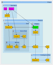
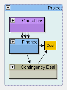
The charts show a typical, though rather straightforward example relating to the risk of financing a project. The larger chart is the fully expanded version which shows how the risk originates in the operations of the organisation where performance and credibility are key for gaining the finance sought. The smaller chart is a condensed version of the same thing, showing an overview. The Alternative Finance element is a risk reduction measure. One strength of risk maps is their ability to show the different proposed mitigation proposals.
We call it an approach rather than a technique because at the moment it is a way of looking at a system which is supported by a range of ideas and tools. Our risk mapping concepts page goes into more of the technical detail of our thinking on risk maps and you can see some more examples in our risk mapping examples page. As our experience grows we hope to be able to provide more definitive guidance on the way to map your risks.